The beauty of movies is their ability to immerse you. By manipulating your mind with deep emotions and connectivity to raw humanity, it fashions everlasting impacts on life perspectives. We revel in just how naturally feelings such as nostalgia, grief, fear, or love are elicited in just a couple of hours. It is that heaviness in your heart as the credits roll, and that aftermath of realising what you’ve felt as you turn away from the screen, that’s the superpower of directors.
A key production technique successful filmmakers use is colour. Colour doesn’t necessarily mean post-production colour grading, where saturation is increased, or when orange hues are added to highlights, or when it turns black-and-white to represent the past; it also includes the in-production usage of everything visible in the scene. Whether this is props, naturalistic lighting, or costuming, directors develop the colour scheme alongside their plot. While certain hues together make the film look pretty to the eye, when in cohesion with other cinematic elements, it is used to portray a story and character development. Colour commonly reflects subtle, vulnerable emotions of characters.
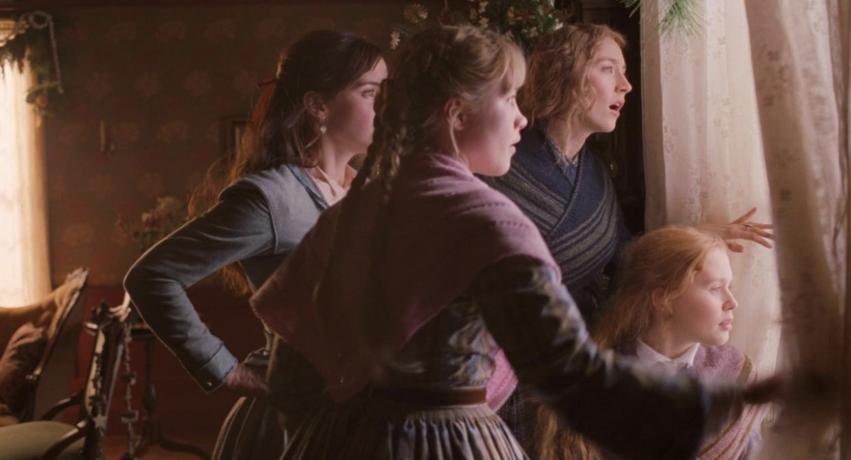
Image Source: https://oldfashionedgirl.blog/blog/the-little-women-face-off-part-4
Little Women (2019), directed by Greta Gerwig, is by far my favourite usage of colour to tell a story. With a non-linear narrative, childhood memories are told with golden lighting: a symbolism of nostalgia and comfort. We follow the protagonist, Jo March, throughout her late teens, and this warm palette reflects her intimate experiences, where life is full of connection with family and friends. Whereas when we switch to scenes set 9 years later, there’s a cool-toned palette that creates harsh cuts between scenes. It feels jarring to watch and somehow feel the new isolation through the lack of light and happiness in the present, symbolising the realities of adulthood and growing up – where seasons of warmth have been outgrown, and stepping into this new reality is painful. Gerwig spectacularly shows us what growing up feels like: childhood memories soften in our mind, making the present more brutal. The feeling resonates with those with cherished old memories, when nostalgia causes ache, which is something deeply human.
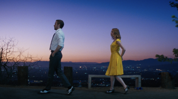
Image Source: https://www.nytimes.com/2017/01/08/movies/la-la-land-movie.html
Damien Chazelle’s film, La La Land (2016), is likely the most well-known usage of bold colours. When I was watching this movie, I couldn’t help but admire how amazingly his bravery in using obvious and bright colour palettes was pulled off. However when I later watched a Youtube colour analysis of La La Land, the detail and intention behind lighting and the shade of every prop wasn’t something I’d picked up, and likely you’d never; filmmakers want to form an experience for audiences, and when colours evoke emotional responses underneath our consciousness, we may not understand why the colours we saw was a helper to how we feel. Take the iconic A Lovely Night scene as pictured above: the purple sky represents love between our main characters, Sebastian and Mia, formed by the combining of Mia’s previous red life and Seb’s blue one. This colour seems almost dream-like: it’s a bright but not harsh shade to look at, bringing blissfulness for the audience as the characters’ individual struggles are now hidden. Mia’s yellow dress is not only for aesthetics, but often is said to symbolise major change in her life. When you look at this beautiful, intimate scene, audiences feel hopeful for the couple, which of course isn’t the result of the relationship, making the film’s ending hurt even more. Of course, everybody may have different interpretations of exactly what colours symbolise what in La La Land, but the conclusion is always that they’re to make us feel changed by the end of the film.
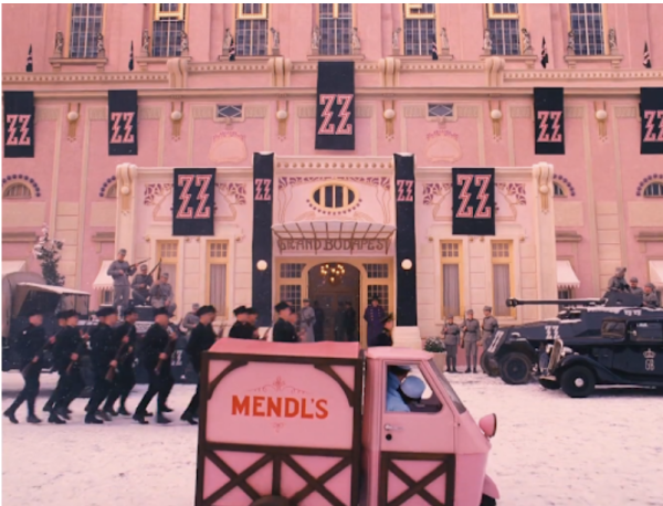
Image Source: http://www.cinemablography.org/blog/the-grand-budapest-hotel-reviewed
When you see a still image from a Wes Anderson film, you can know it’s a Wes Anderson film without even knowing the movie title. This director is known for his unique colour palettes, his most famous usage being in The Grand Budapest Hotel (2014). While there are four main timelines told, our main one follows M. Gustave in 1932, a hotel concierge. Deep hues of pink, red and purple create an image that’s fantastical, whimsical, seemingly unreal. The colour palette creates harmony and an almost magical atmosphere for audiences. However, when other timelines have lower saturations, the dulling of these assuring hues can make us uncomfortable – we feel the loss of life throughout the film. The inevitable change of a memory, or something good, is hurtful, and Anderson’s colours reflect this relatable feeling for us.
Colour as a production technique doesn’t create moments when you instantly realise the references the director’s making; instead, this skill to be so subtle with emotional manipulation through a simple technique such as colour is what makes it so easy to connect to films.
Sources:
The Little Women Face-Off, 2024, An Old Fashioned Girl, <https://oldfashionedgirl.blog/blog/the-little-women-face-off-part-4>
The Use of Colour in Little Women (2019), 2020, YouTube, <https://www.youtube.com/watch?v=kNsDkrAhiio>
The Psychology of Color in Film, 2026, Nofilmschool, <https://nofilmschool.com/color-psychology-in-film>
Colour as a storytelling device in films, 2021, Fourth Wall Content, <https://www.fourthwallcontent.com/blog/colour-as-a-storytelling-device-in-films>
when the director happens to be an expert in colour theory, 2024, Youtube, <https://www.youtube.com/watch?v=YGRBXsMsyng>
Colors of La la Land, 2024, Today the 50th, <https://www.todaythe50th.com/post/colors-of-la-la-land>
Why is La La Land so purple?, 2023, Youtube, <https://www.youtube.com/watch?v=7Vj_RZDSHqc&t=241s>
The Grand Budapest Hotel Color Palette Analysis, 2026, Pixflow <https://pixflow.net/blog/the-grand-budapest-hotel-color-palette-analysis-wes-anderson/>